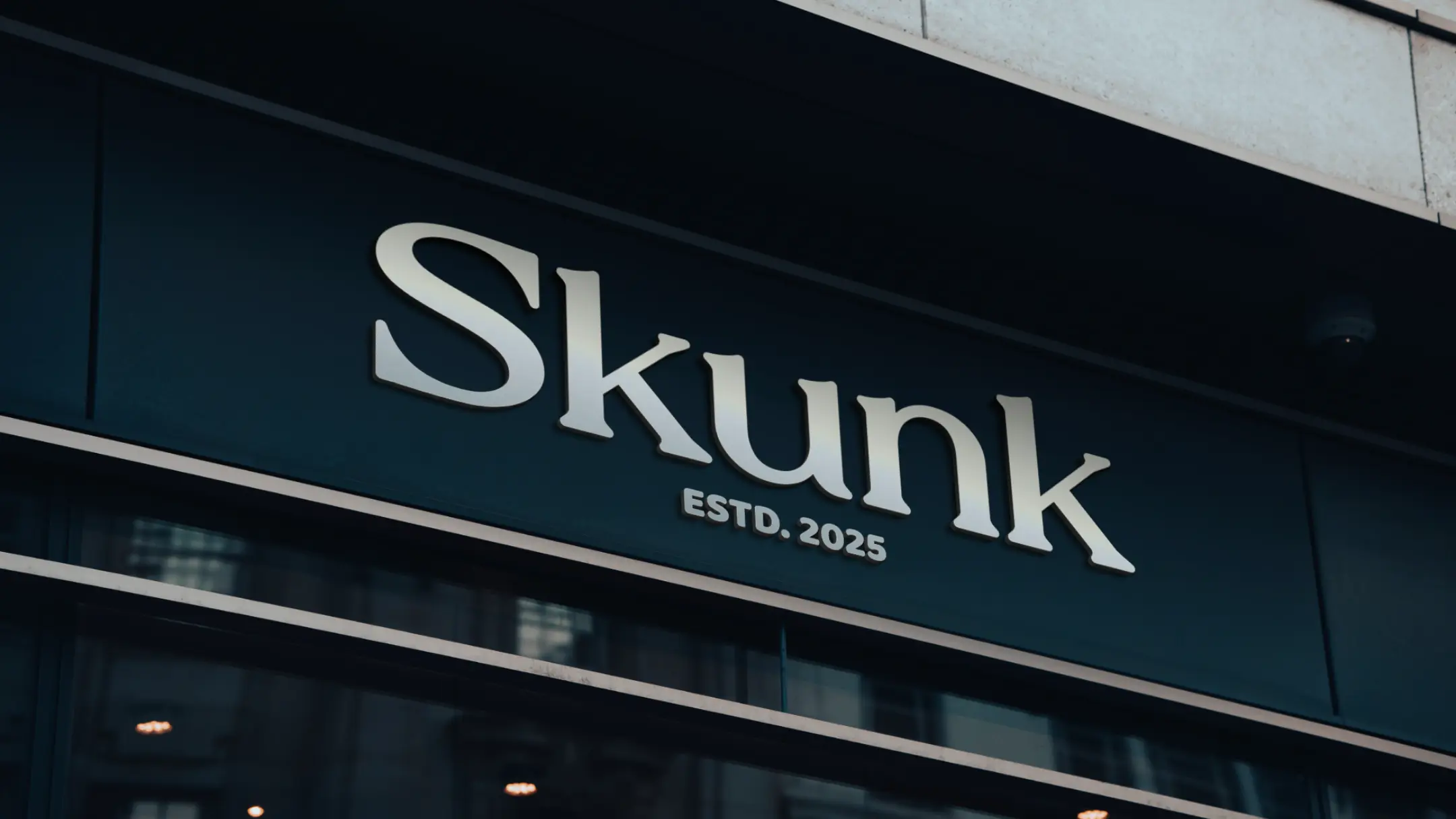
Skunk Creamery
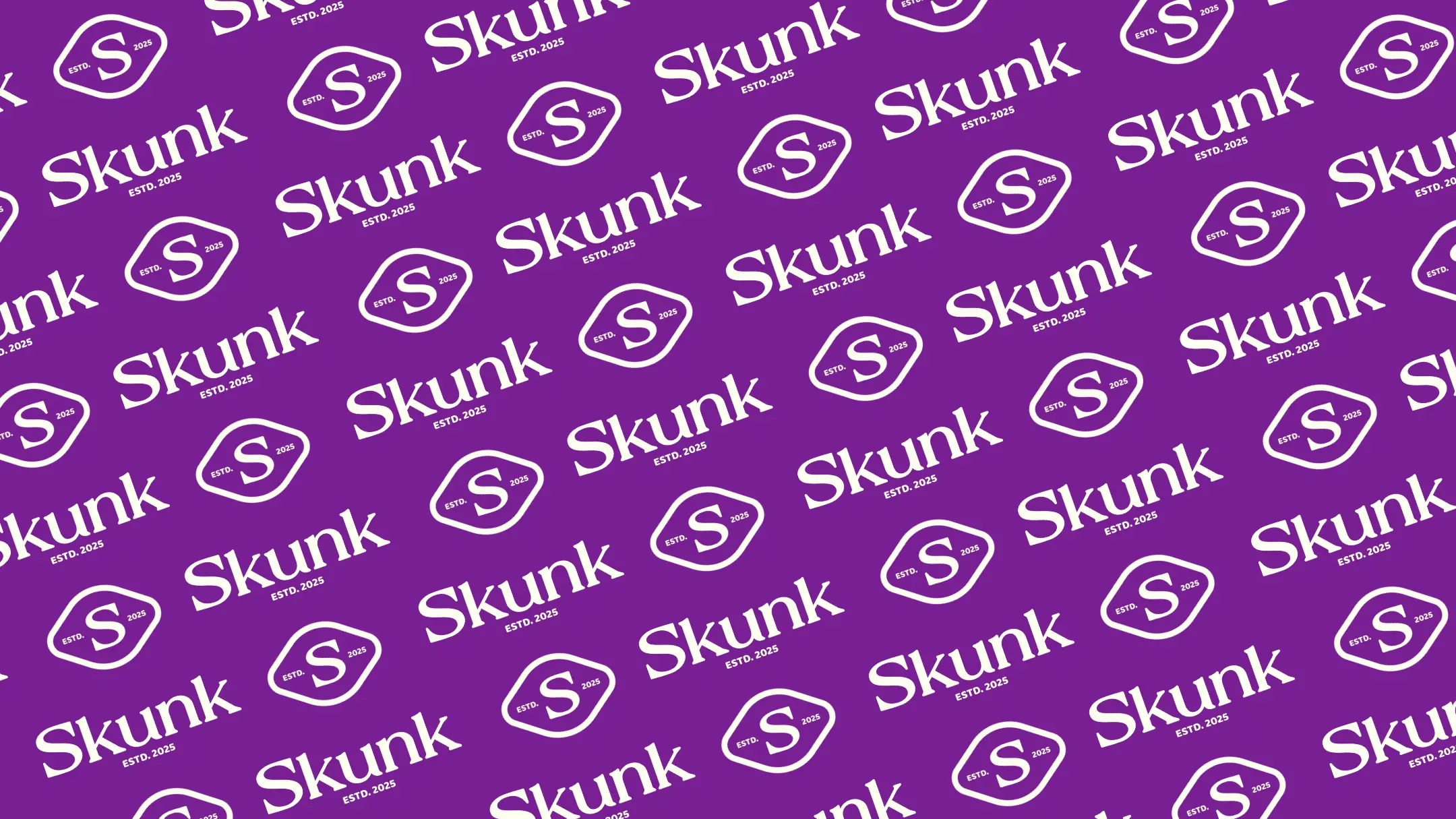
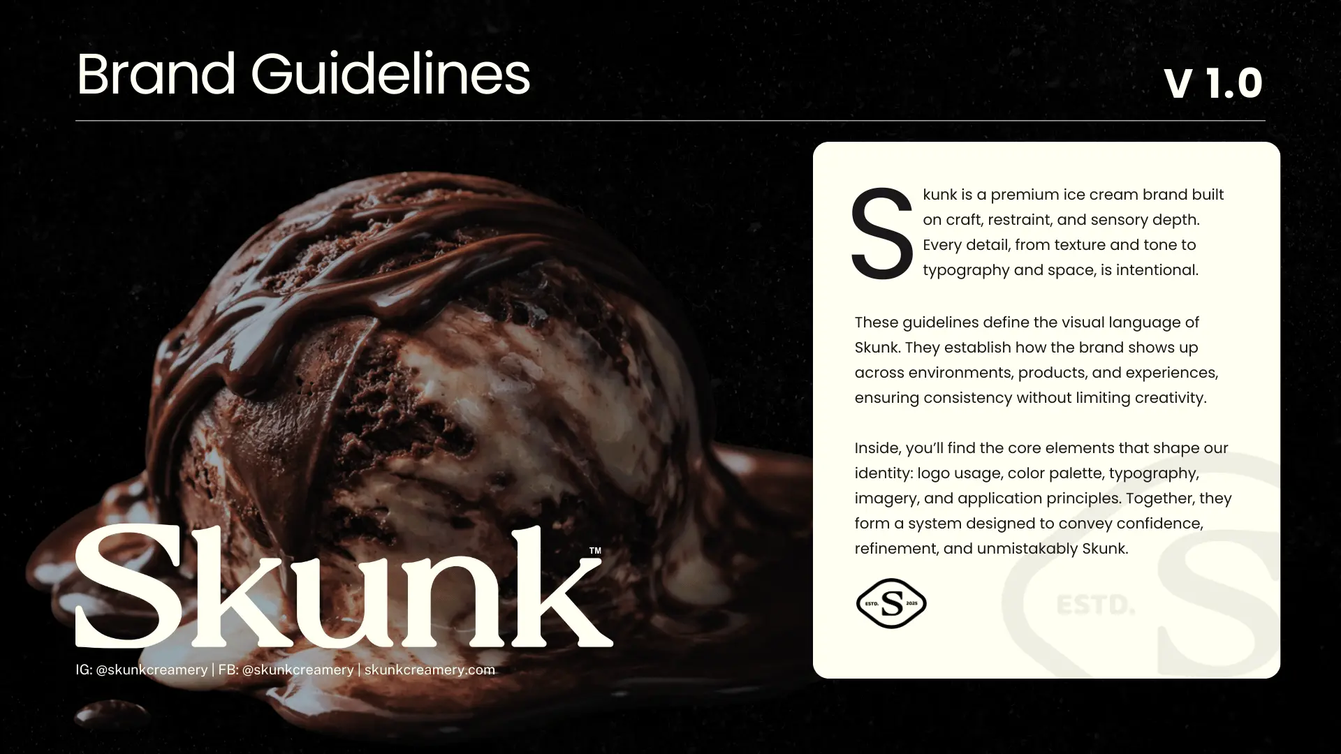
A refined, approachable identity for a large ice-cream brand built on trust and authenticity.
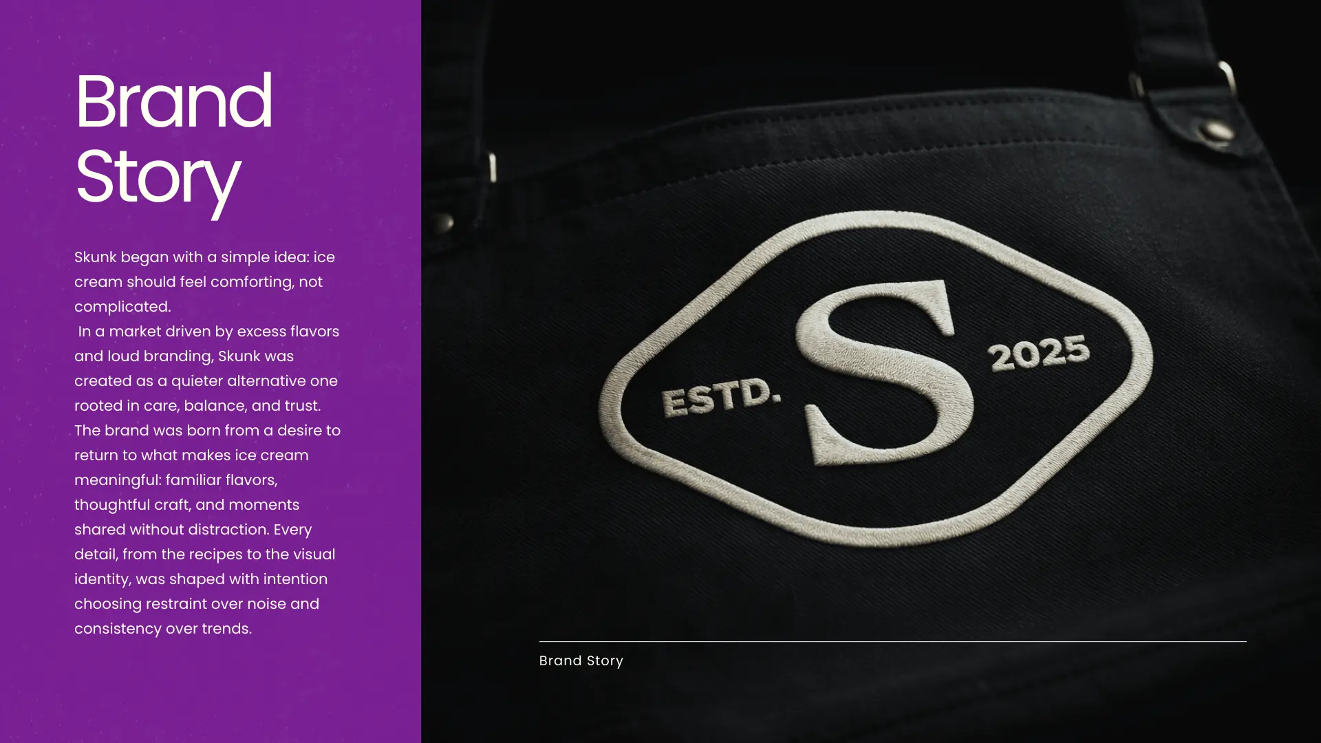
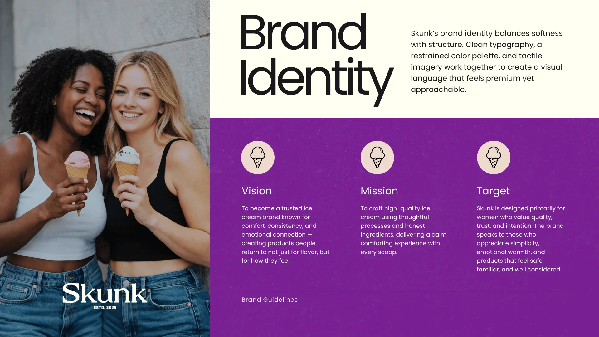
Skunk is a large ice-cream brand built on trust, authenticity, and comfort. Its audience seeks not just quality products, but reassurance - a brand that feels safe, familiar, and reliable. The project focused on creating a refined, approachable identity that communicates gentleness without losing confidence.
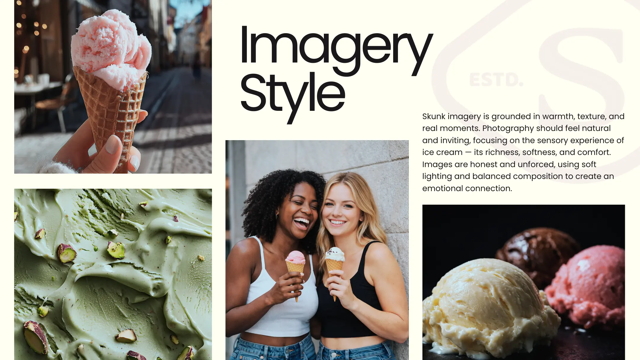
The resulting visual system emphasizes clarity, restraint, and consistency, positioning Skunk as a trustworthy, emotionally resonant brand designed to feel comforting, clean, and dependable - especially for a female-focused audience.
The Approach
Gentle Confidence
The brand needed to feel approachable and safe without being passive. Every design decision balanced gentleness with confidence - creating a visual tone that reassures and invites trust.
Clarity and Restraint
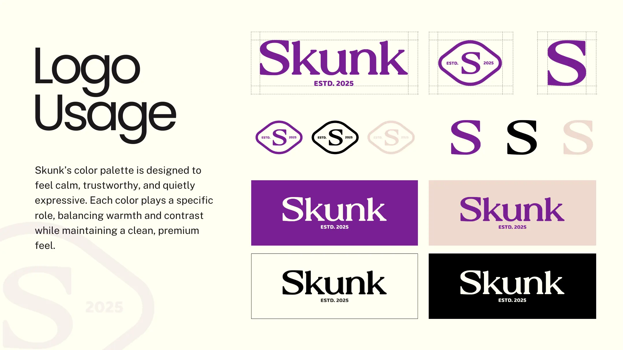
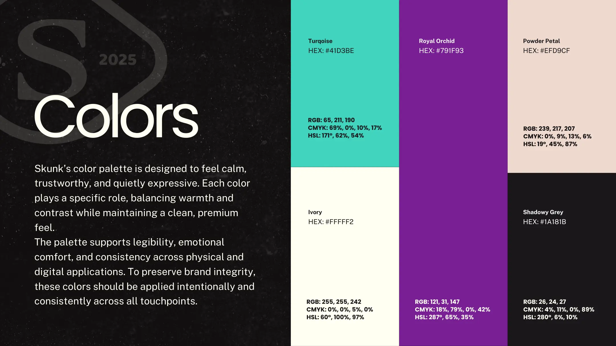
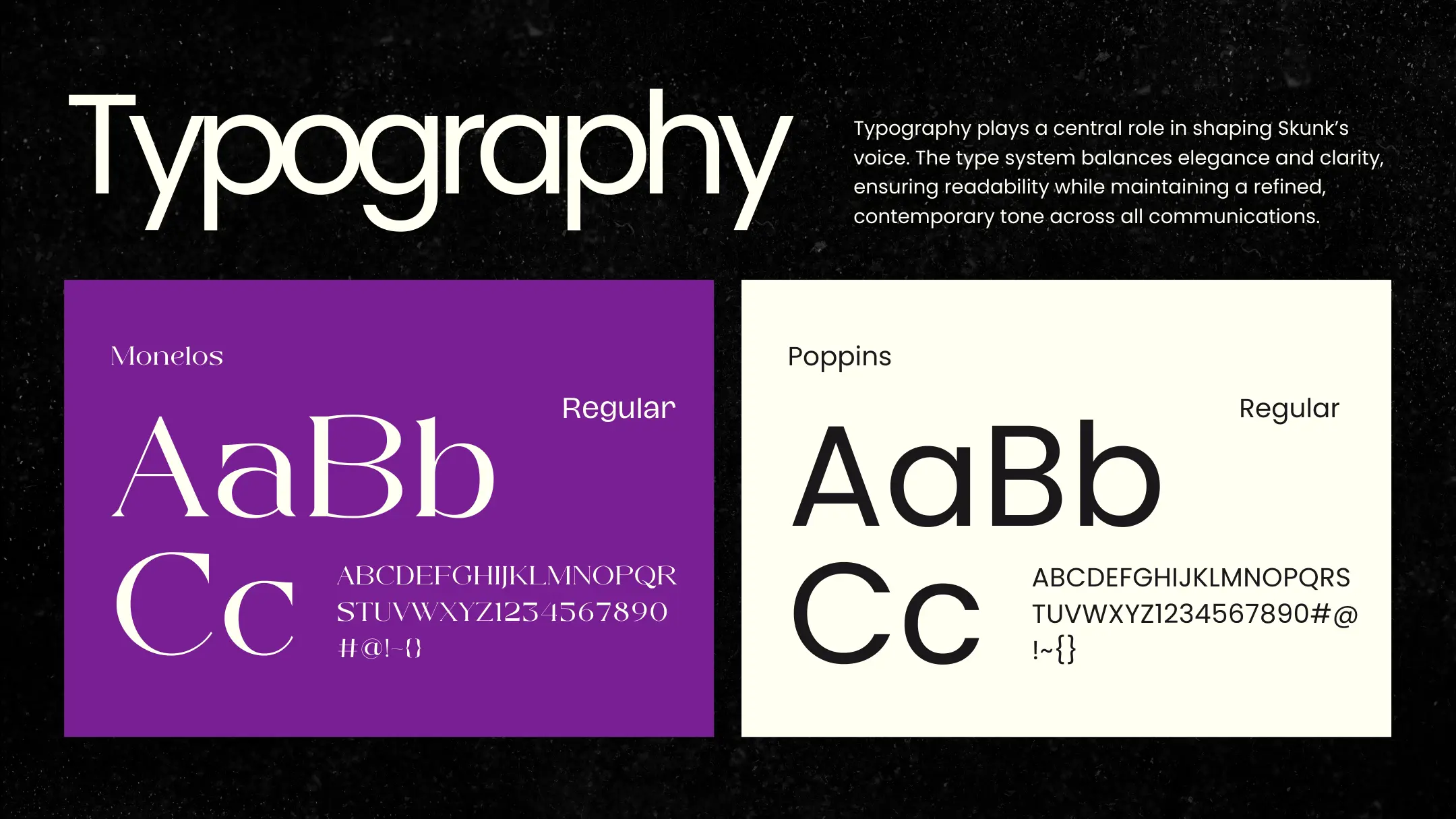
The visual system was built on simplicity - clean typography, restrained color, and consistent application. Nothing competes for attention; everything works together to feel calm and dependable.
Emotionally Resonant System
Beyond a logo, the identity is a cohesive system designed to feel comforting across every touchpoint - from digital to physical - reinforcing Skunk's promise of authenticity and reliability.